
What makes the best association website? Is it the user-experience? The color palette? The typography? The design? Or, a combination of all of these elements?
There’s one thing we can all agree on. The main goal of a website is for an organization to get its message across to its target audience. The way they do that can be as unique as the organization themselves.

Non-profits are diverse in type and mission. They collect donations, support advocacy, put on events, and collect membership dues. They can be a trade organization, a professional society, or a user group. The options are endless.
A website for a non-profit organization may need calls-to-action, engagement, and donation capabilities built into the site design. A professional or trade association website needs to be able to handle events, recruitment, and resources.
Your website must be as user-friendly and intuitive as it is beautiful. Why?
Because it’s often the first impression a potential member gets about the organization. A bad first impression could be costly.
In a rush? We’ll send helpful tips to your inbox.
By providing your email address, you’ll start receiving two monthly design and marketing news emails from us.
We have searched high and low to find what we believe are the best of the best association websites. This is our take on the top association website designs out there.
1. Internet Association

Prepare to be mesmerized. The Internet Association uses dynamic elements on the homepage of its website with excellent use of gradients. Watch the circle go round and round as colors change.
The hero area typography and design elements on the page makes a strong statement. The Internet Association’s mission statement is incredibly simple yet powerful. The subtext from the design reads modern, bold, and cool which draws the user in.
The navigation menu at the top of the page is crisp and the structure is clear. Headers turn from white to blue when the user clicks on it.
Overall, the Internet Association gets its point across with a website design that is big, bold, and colorful. It has a modern look that is vibrant and smart.
2. The United Food and Commercial Workers 770

“Welcome to the 770”. You are greeted by a strong welcome to The United Food and Commercial Workers (UFCW) 770 page as you take in the power of community.
The UFCW 770 advocates for workers in the industries of healthcare, retail health, grocery, packing, and cannabis in the state of California. And the website does a great job of telling the story of their inception and members.
Hover your mouse over a photo of a member and it turns from blue to full color. It makes the story of each member really come to life on the page.
The mega menu is tucked away in the upper right-hand corner of the main page. It’s very well organized. Once clicked on, it expands to take up the entire page. It’s easy to navigate with helpful icons to guide the way to each industry’s landing page.
The 770 has a modern website design and uses bright primary colors. The accented photographs of its members give it a more personal feel.
The feeling of community, power, and unity is evident throughout the copy and design. It communicates this is an organization that clearly stands up for its members and what they believe in.
3. The American Lung Association

A breath of fresh air. That’s what The American Lung Association’s website is like. The color palette is monochromatic, but the use of neutral colors like white, grey, and blue gives the website a nice clean look and feel.
Photographs in geometric shapes make the pages unique and interesting. As you scroll down on the page you see stats, events, and blogs.
The hero area communicates the big picture vision of the organization. Quickly followed with calls-to-action to “donate” and “get involved”.
For a non-profit organization, a vision statement and CTA that’s front and center is a must. The American Lung Association clearly knows this fact.
The navigation menu at the top of the page is educational and also action-oriented with headers like “quit smoking” and “get involved”. It includes highlighted information with an option to view more as to not overwhelm the user with the amount of information available.
Clean, crisp, and airy, this association website design fits the association to a tee. It commands action and advocacy for critical diseases.
4. Telus World of Science-Edmonton

Upon landing on the Telus World of Science-Edmonton’s website, you see a carousel of different images and features. It’s intriguing and brilliant- exactly what science is.
As your mouse scrolls over the top menu, image, copy, and the drop-down menu selection appear in a geometric shape overlay.
This website is theatrical with its many layers. The shapes and angles create an interesting and unconventional layout. It’s fun and makes you want to explore the world of science as a kid again.
Photographs accenting the copy are placed strategically throughout the design. Important information such as hours, showtimes, and prices at the very top of the page for easy access.
This website makes science cool and interesting with its use of shapes and imagery in strange angles. It’s different yet beautiful, and that is what we love about the Telus World of Science-Edmonton’s website.
5. Captive Insurance Companies Association

Classic and professional is how we would describe the Captive Insurance Companies Association’s site.
They recently changed their site to introduce their new look in a rebrand. The website is simple and extremely functional for the organization’s needs.
It uses a couple of different navigational elements. The user can easily access content to learn more from the mega menu dropdown.
The homepage features important information and events in content blocks. It breaks up the content in a logical way that the reader can easily follow.
Quality landing pages such as the “Amplify Women: Revisited” page are linked to the homepage. They have a beautiful and clear design with the opportunity for the reader to “read more”. Related articles are shown at the bottom of each landing page so the reader doesn’t have to go back to the main page.
The page is coded with the “domicile” tool which allows users to compare domiciles that are a key part of the captive insurance process.
There is no question the Captive Insurance Companies Association website has great UX design. It’s so easy to navigate. The website has a timeless look and design that will never go out of style.
6. Truth Initiative
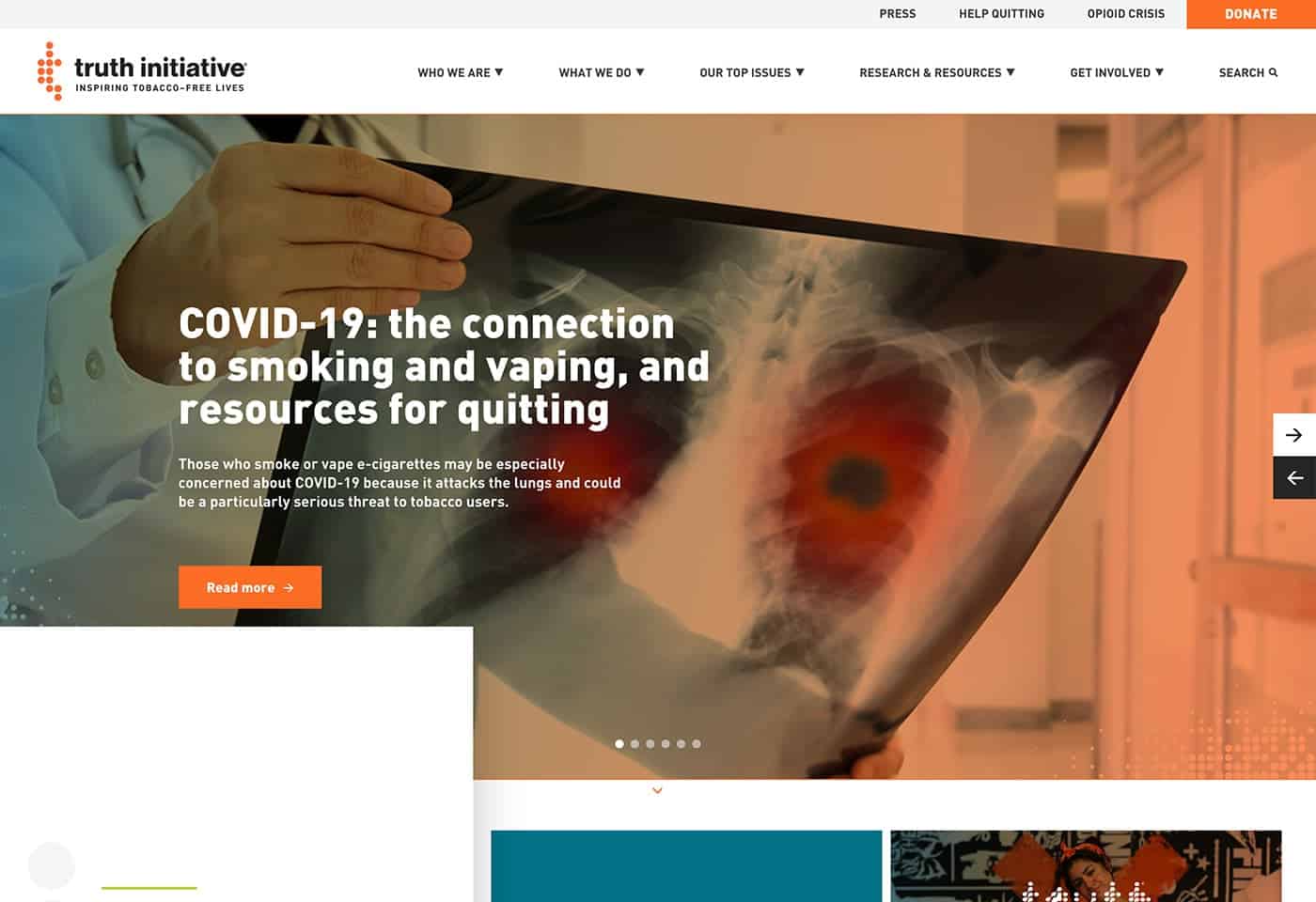
The truth about this website is it’s simple yet effective. It uses a carousel with images to feature educational pieces on its mission: inspiring tobacco-free lives.
The Truth Initiative educates on the effects of using tobacco. The design uses squares and headers to convey the message, research, and news as you scroll down the main page.
The color scheme of fuchsia and orange is a unique combination. You wouldn’t think they would go together but it works. It’s bright and colorful and has good use of white space.
The navigation menu drops down to fill the page once a user clicks on one of the top headers. It’s clear and well organized.
Top issues for the organization and research are included in the main navigation menu. It’s well put together with the Truth Initiative priorities in order.
This site is colorful and youthful-looking in addition to its effectiveness which is it makes our list.
7. The Surfrider Foundation

The Surfrider Foundation’s website is as giant and breathtaking as the ocean itself. This site has a balanced layout and is effortlessly elegant. We love the water and we love this website.
The typography commands attention to its cause- protecting the world’s oceans and beaches for the enjoyment of all.
The hero image on the homepage changes every time you refresh the page. Same organization and website with a new look. It keeps it fresh for recurring visitors.
There is also a call-to-action under the hero to “donate” or “volunteer”. A user can quickly assess what the organization is about and find ways to get connected.
The menu is short and to the point. The Surfrider Foundation wants your attention on the homepage – and it’s clear why. The homepage steals the show.
8. Care.org

The photography used on Care’s website speaks for itself. The user knows this is a worthy cause.
The homepage prioritizes the story items and news right from the beginning. It takes you on a journey to learn more and identify ways you can help.
The menu is short and simplistic. The main story is on the homepage, peppered with appropriate images to describe the organization’s efforts.
Typography on the site is bold and does a good job of highlighting the urgency for action.
Overall, this makes an impact on the visitor. It uses imagery, balance, and minimal text to convey the importance of its cause.
9. AMA – Chicago

What’s key to every association? Its members. The American Marketing Association (AMA) Chicago chapter ditched stock photography to feature the members of the organization.
The website also highlights upcoming events, which are a draw for new and existing members. Events are listed first for this reason.
A coded resource directory makes it easy to see who is a part of the organization. It’s a good way to network and leverage the association’s contacts.
The design is clean and user-friendly. It has a logical layout that makes it intuitive for the user to find what they are looking for.
Simplistic and powerful, this website is custom-built for the organization’s unique needs.
It makes you want to join and get to know the faces in the photos personally. It’s one of the best professional association websites.
10. The National Association of Manufacturers (NAM)

The images tell the story of the real hard-working people who make up NAM. NAM does a good job of pairing these candid photos with links to news articles and resources, for example.
The website has a very user-friendly navigation bar. The bar has three sections – Workforce, Policy & Legal, and Business. Everything else is tucked away in a hamburger menu which makes for an organized homepage.
Additionally, engaging members is a cinch, as the NAM website has a call-to-action to “get involved” in the right-hand top and bottom corners of the page. News and insights are accessible above the fold and right below the fold making it easy for a user to stay informed.
This website is functional, well organized, and has a real down-to-earth vibe to it. We like how NAM organized their content.
The Best Association Websites of 2020 – In Closing
Associations have important visions and goals. As a result, they connect people to others, events, and to critical causes.
A website is more than just a website for an association. It tells their story. It serves as a canvas to convey the impact they make on the world and in their local communities.
A website is a storyboard, a community builder, an education platform, and a fundraiser. It must combine user-friendly design with beautiful art. It must communicate emotion and spark action.
Through our tour of association websites, we saw the best of the best in terms of design.
All of these websites used quality images, nice typography, and added their unique flair.
They had well-structured navigation menus and calls to action. News, blogs, and stats were sprinkled throughout the page with ways to sign up to learn more.
A combination of all of these features makes them stand out.
So there you have it. Our top 10 association websites of 2020. A mix of association and nonprofit websites containing intelligent design and layout with artistic elements.
