
Being able to provide useful web design feedback is more important than you might imagine. As you and your web agency build a site for the future, you have to take the power of good UX seriously. According to a recent study conducted by Stanford, 75% of users admit to making judgments about a company’s credibility based on their website’s UX design. Another study says that it takes less than two seconds for users to form an impression of a website.
Knowing the ins and outs of good web design feedback is also important because it will create a great rapport with your partner agency and will help the project move forward smoothly and quickly.
Everyone has an opinion of how the perfect website should look. Some are wowed by bells and whistles. Some prefer minimalist or dead-simple web design. The possibilities are endless. However, the best designs all have a few things in common: they employ user-centered design principles and focus on providing great user experience.

Good web design is a team sport. It involves extensive user research, shared understanding and buy-in from both the web design agency and client. But getting to that point can be difficult if the right type of web design feedback is not given right from the start.
In a rush? We’ll send helpful tips to your inbox.
By providing your email address, you’ll start receiving two monthly design and marketing news emails from us.
Here are 7 web design feedback tips to help you do just that.
1. Web design feedback should add value

It’s easy to get overly eager to see the web design take shape. After all, aside from launch, this is the most exciting part of the process: when you are imagining the countless directions your project can take. Requests should add value and move the design forward. “Make the logo bigger” might seem like appropriate web design feedback — but it could actually lessen the design or take visual focus away from an important call to action.
There are fonts, colors, or patterns that may not work well together on the web despite being elements of your branding. And not everything can fit “above the fold”. Too much clutter can confuse and overwhelm the user. The key for a great user interface design is to make sure each page focuses on a few important interactions and no more. Remove irrelevant images or copy, meaningless flourishes, and overly-decorative interactions – anything that gets in the way of your message and keeps the user from doing what they want to do.
2. Trust the web design feedback process
Remember, when trying to solve a problem, you need to try different things to get the best results. Design is a conversation; some take longer than others to come to an agreement. Keep an open mind, and know that it might take several revisions to get it right. So don’t get discouraged. A good digital agency can take your vision and turn it into something that’s audience-focused, looks great, and adds measurable business value.
Your web agency should also be able to sit down with you and provide new strategies or brainstorm new ideas if you are not quite sure about your web design direction. Remember your job is to guide the process, not micromanage it.
3. Make audience first

As the process unfolds, it’s critical to keep your target audience in mind. It can be easy to nitpick a prototype based on what you personally like or dislike. But you have to be able to set your feelings aside. Remember the shared vision you started with, the goals for the project, and have a productive exchange of ideas. Instead of overreacting to a design solution, frame your web design feedback within the parameters of the project and always push forward.
4. Avoid empty words and phrases
One of the worst things you can do is provide vague feedback to your website design agency. There is nothing more frustrating than when a client says things like “jazz it up,” “make it pop,” or “it’s all wrong”. These phrases could mean anything to anyone. You might think “jazz it up” means bigger and bolder. I might think “jazz it up” means brighter colors. See how these types of phrases can be problematic and cause confusion?
For example, you can say, “I would like to draw more attention to the hero area by making the headline bigger and bolder.”
Instead of “I just don’t like it”, offer alternatives (or examples) that fix what you dislike. Talking your web design feedback thoroughly will often uncover issues that you initially omitted.
Be specific so your agency doesn’t have to guess!
5. Be honest with your web design feedback
No hard feelings. Really. Part of being a designer is getting critiqued. If something is overlooked or the direction of the design is not what you are looking for, let your agency know right away. The further along they get in the process, the more difficult it becomes to make changes. Early feedback is crucial to a smooth relationship between you and your agency. If something doesn’t feel right, speak up.
6. Ask questions
Feedback should be an open discussion, not just a list of changes that you send off to your web design agency to review. Asking thoughtful questions creates a dialogue between you and your agency. Allowing both parties to contribute will help everyone become part of the solution.
For example, you can ask a question like: “I’m used to seeing websites with the hamburger menu at the top right of the page. Is there a reason why you chose to put it on the left?”
Don’t be afraid to ask questions. This gives your agency the opportunity to explain their thought process behind their design choices.
7. Web design feedback approval checklist
You made it! You reached the end of the project and are ready to deliver the final product. Here’s a quick list of things you can review before approving the final website design.
Useful Navigation
Are the most important pages in your primary navigation? What about less important ones – are they included, too? Use business objectives and visitor analytics to determine what gets prioritized. Keep the main navigation concise but still useful. Stick your social media links and other flare in the footer.
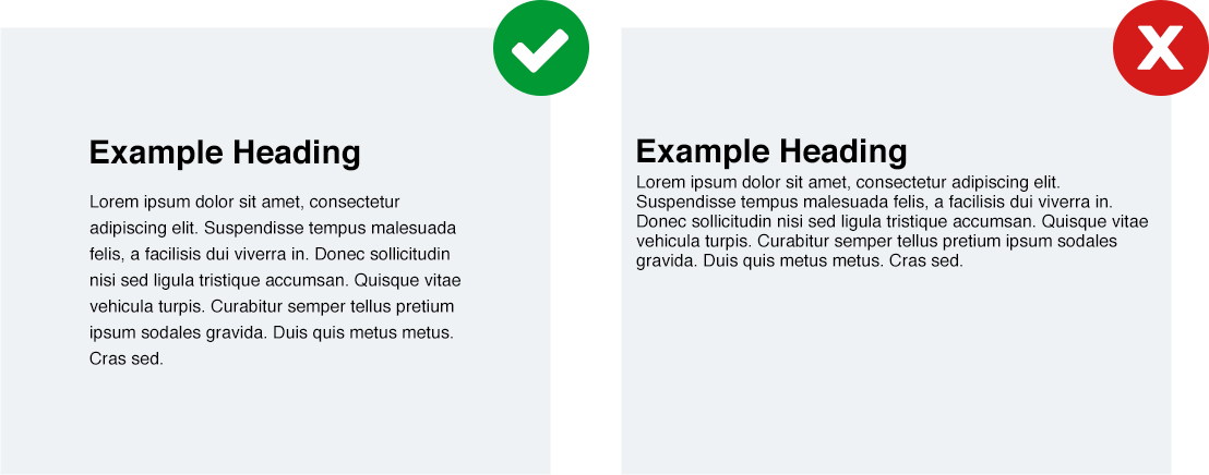
Scannable Content
It’s hard to control how people will browse your website, but you can present content so that users can find what they need quickly. Write your website copy with the user in mind. Does the website design make content easy to find? Don’t assume users will read the entire page to act. Make any key points in the first couple paragraphs of the page. Use keyword-rich headings and subheadings (ideally 2.5x larger than body font and in bold) to show what’s important and grab the user’s attention.
Readable Fonts
Displaying content in a usable and useful format that encourages reading and interaction is vital. Are the fonts chosen by the designer easily readable throughout the site? Are the fonts large enough? Text-heavy pages should be at least 16px, preferably 18-20px. Tip: when text field or search inputs are less than 16px on iOS, it causes Safari to zoom into the form, even after submitting when the keyboard is hidden.
On-Brand
A well-designed website is frequently the most visible representation of your brand. A strong brand creates trust with a site’s various audiences. It can work at an emotional level and create loyalty. Does the design reflect who you are? Will it create a sense of pride within the organization and occupy the consciousness of your stakeholders?
Proper Contrast
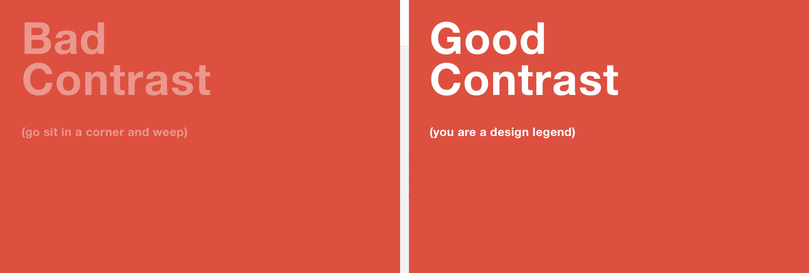
Contrast and color use are important parts of good visual design and accessibility. Users, including users with visual disabilities, must be able to perceive content on the page. Is there enough contrast between the background colors of your site and the font colors used? Tip: you can use this tool to see.
Whitespace
Whitespace (or negative space) is the space around and between the elements of a layout. It separates unrelated elements in a design to deliver a clear message. Well-proportioned whitespace is one of the most effective ways of guiding your users from one element to another. It creates harmony and visual comfort in the design. Too little whitespace makes a design feel cramped and disorganized. Too much whitespace can highlight a lack of content or feel too sparse. The key is balance, so keep this in mind when you’re providing web design feedback to your agency.
Alignment
Is there a clear structure among the visual elements presented in the design? Do elements align as expected? Painstaking alignment of copy and images add order and an extra level of polish to a design.
Text can be aligned left, right, center or justified. When in doubt, use left-aligned text. Centered is ok for headings but harder to read in paragraph format. Justified is great for print and newspapers, but hard to control across all screen sizes. Avoid it. Finally, right-aligned text should be used sparingly or not at all.
Well-placed calls to action (CTAs)
A CTA refers to any device designed to prompt an immediate response or encourage an immediate sale. Are the CTAs clear in the final version? Are they displayed in a prominent place that makes sense? Are the labels action-driven? For example, do you see any main calls-to-action with the word ‘Submit’ or ‘Learn More’ instead of something that is more action-driven (eg ‘Schedule a Demo’)?
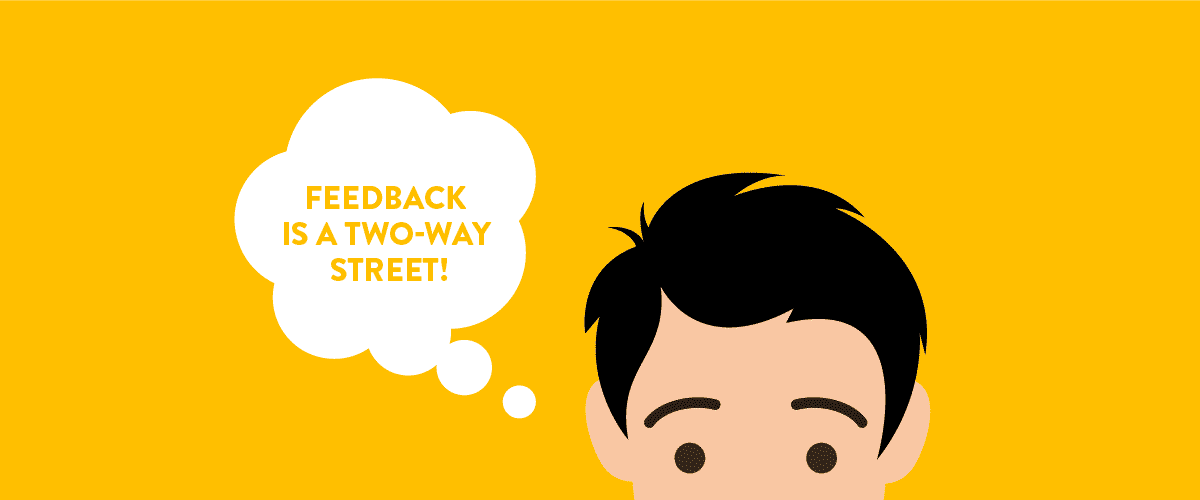
Web Design Feedback: Conclusion
Giving constructive web design feedback not only helps you save time but also helps the design process move forward. Don’t be afraid to raise questions or any concerns you might have with your agency. After all, it is their job to find unique and creative solutions for your project. But remember that feedback is a two-way street. A collaborative effort will achieve the best results.
