
When was the last time you came across an association web design that had no images or words? Obviously, never. Following years of experience, these are the main components of any professional site. But how do we use these elements to take your site to the next level for your members?
In this post we want to explore how photography blended creatively with typography can have a huge impact on multiple aspects of your website including readability, mood, article length, user experience and more.
Let’s start with photography.
Images provide a better user experience
Images should be more than just decoration; they have the power to make or break a user’s experience. Most images have a story to tell and the power to inspire and engage an audience. Good photography can be used to build trust and credibility which is crucial for any organization.
Here are some things to consider.
High-quality photos are a must
Images should not appear pixelated or distorted, so be sure to test your images across multiple screen sizes to ensure they look nice and crisp. Imagine trying to use a small image for a full-width banner it just wouldn’t work. In general, you want your images to be larger in size. By large, I don’t mean file size I mean pixel size because you can always maintain quality scaling down since images become blurry and pixelated as you scale up.

Image size and ratio
Choosing high-quality images for your association web design is not enough. You also need to consider how they’ll work with your website layout. For example, most websites rarely use standard 4×6 images because from banners to slideshows to team pictures the sizes can vary. Keep in mind, not every image you find is going to work without making some adjustments. Most of the time you’ll be able to change the aspect ratio also known as the shape or the size without compromising the subject of the image, but sometimes that won’t be possible.
Select and use stock photography wisely
Stock photos are usually great for general topics or city scenes, but it’s best to use original photography as much as possible. If you can’t afford to hire a professional photographer, here are some things to consider before you buy stock photography for your association website design.
- Stock photography can be bought by anyone: It’s like shoes you buy off the rack at a popular shoe store. No matter how cool the shoes are, you won’t be the only person wearing them.
- Some stock photography can lack personality, feel inauthentic, and cheap. Most stock photography won’t be able to enhance your association brand without relying on clichés.

Which one looks like some sort of generic corporation meeting? As you can see natural lighting and natural interactions make all the difference.
When should you use stock photography?
- For projects that have a limited budget
- To supplement existing photography with stock photography just make sure you find images that match in style and tone.
- For simple images that don’t require much detail or that are being used for decorative purposes.
Add personality to your photos
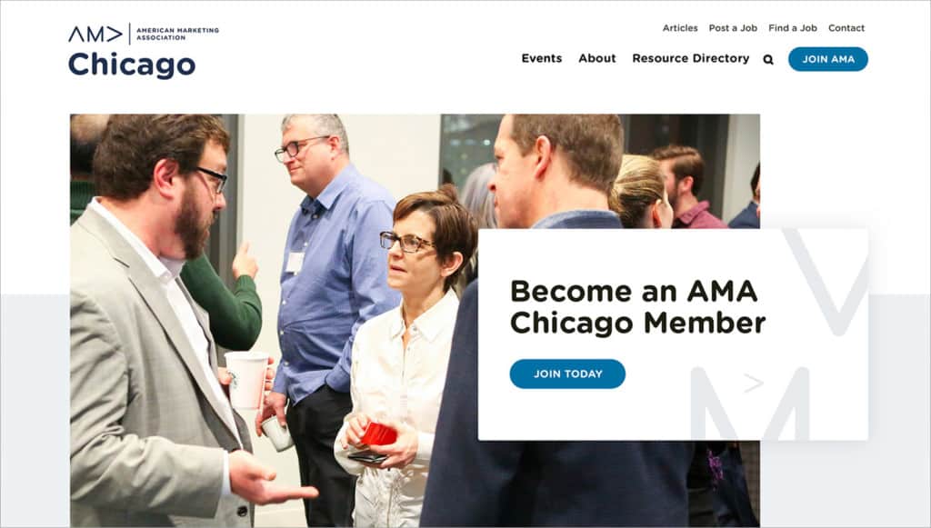
Personality makes photos more interesting, and the best way to add personality is by showing real people. Show your association’s members interacting with each other in one of your events or show your staff getting work done in the office that will help create an authentic and emotional connection with your users. The more “real” people look on your website, the more users will trust and connect with your association.
When using images with faces on your association website — you need to create imagery that actually represents and enhances your brand. Stock images can work, but they must be used with care. Remember, the goal is to establish a connection with your existing members and potential new ones, something that looks cheesy and doesn’t compliment your color scheme likely won’t be effective.
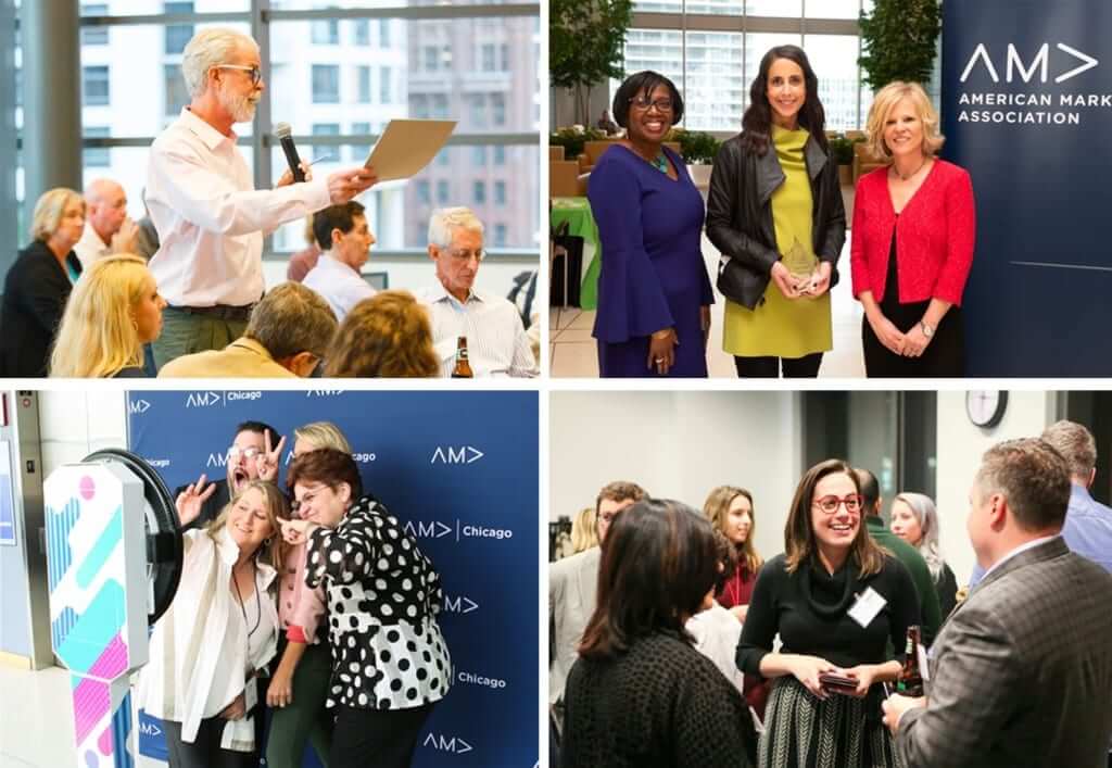
Tell your organization’s story
To appreciate the impact of your association work, people need to look at the bigger picture. One way to accomplish this is to have a series of images all working together to tell the brand’s story. Humans are visual creatures. Think about memes and GIFs and why they are so popular. They take only seconds to read and they’re funny. So, how can you leverage the power of photography and storytelling to connect and engage with your audience?
Here are some things to consider to ensure the best association website designs.
What kind of emotions would you like to evoke in your photographs? Who are the characters, what are the plotlines, and actions in your story?
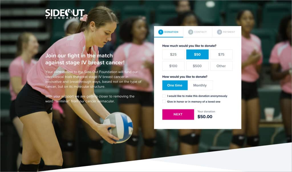
For example, a good story with a good set of photographs can highlight how your organization made the world a better place, how things were, what your association did to change that, and how things are now. A good story, if done well, will evoke emotion. That emotion can encourage people to donate, or act on something — which is what every association wants people to do.
Find a fresh perspective
There are millions of associations out in the world, what makes yours different? Stand out from the crowd by taking some time to find a unique angle to tell your association story. Every organization has important stories to share and it’s up to you to tell them. Have your members, employees, or volunteers share their experiences and stories in their own words that can help you find something worth exploring.
Tips on how to pick images
- Choose images that fit your association mission, vision and values.
- Show images relevant to your content. It’s important to choose images that enhance and reinforce the message you want to deliver to your users.
- Use emotionally powerful imagery by selecting the most compelling images you can find and using them in key areas like above the fold and other prominent areas of your site.
- If you have the ability to take high-quality photos yourself, do it.
- Use stock photos if you have no options, it’s better than using low-quality photos or no photos at all. Websites where you can find high-quality royalty-free photography: www.unsplash.com, www.PikWizard.com, or www.pixabay.com.
As you can see images can have a great effect on your website. Typography can also have the same type of effect and here’s how.
Type carries your brand forward
Typography accounts for over 90% of the design and yet typography is often overlooked. The words on your association website matter, so, the way in which you present your content should be well organized, interesting and aesthetically pleasing.
Do you want an award winning association website? Here are a few typography tips to consider to rank among the best.
Fonts have personalities
Typography and font-choice should not be an afterthought when designing and developing a website. Typography lets you create a certain atmosphere just by choosing the right typeface and arranging it correctly. For example, you wouldn’t expect a music festival website to use the same font as a law firm. Serif fonts, like the one used on Vogue magazine website, have a glamorous and sophisticated look. San-serif fonts like the one used on Apple’s website have a clean and modern look. As you can see it’s important to pick a typeface that is appropriate for your association, but also one that compliments your branding and image.

Good typography guides the readers through your content
Most web readers scan content. Good typography will let a user scan the content and also guide the user’s eye through all the content on the site. Keep in mind that good typography is not just about picking the right set of fonts, it is about creating a visual hierarchy that works for your content by using a grid, white space, font sizes, and weights to arrange all typographic elements in your design.
Elements of Good Typography

Hierarchy: Type hierarchy organizes and gives an order to the text elements (H1, H2, H3, p) in the design and also helps with SEO. Hierarchy can be determined by the size of the text, weight, color, contrast, white space, and alignment.
Size of text: The most common method for establishing hierarchy. The size of the words on the page can enhance or detract from your user experience. The text must be large enough to be legible. If a user has to zoom in or out it will impact their user experience in a negative way.
Contrast: A great way to create contrast in your content is by using a combination of two different fonts, or using one font with two different weights and sizes.
White space: Spacing is also important when considering text size. Having the right amount of white space between characters and words can impact the appearance of the content and its readability. Having letters too far apart will not only be harder to read but it will make the content appear longer, which may discourage some users from reading it.
Consistent Alignment: The way that your text is aligned can dictate how the reader navigates through your website. There are four types of font alignment: right, left, centered, and justified. For the most part, you will use left and centered the most. Avoid using centered for long pieces of content and use justified and right sparingly or not at all.
Conclusion

Effectively used, typography and photography together can help send more visitors to your website, promote social sharing and ultimately help drive your association web design’s vision, mission, and values. Don’t underestimate the details. They can be the difference between mediocre and next-level.
When effectively used, typography and photography together will establish a stronger connection with visitors. These tools will also promote social sharing and ultimately help drive your vision, mission, and values. Whether you’re a member association or a trade association, don’t underestimate the details. Details matter. They are the difference between mediocre and next-level web design.
