As a participant in the web space, you have a front row seat to the most heated debates in UI design.
Here’s just one example:
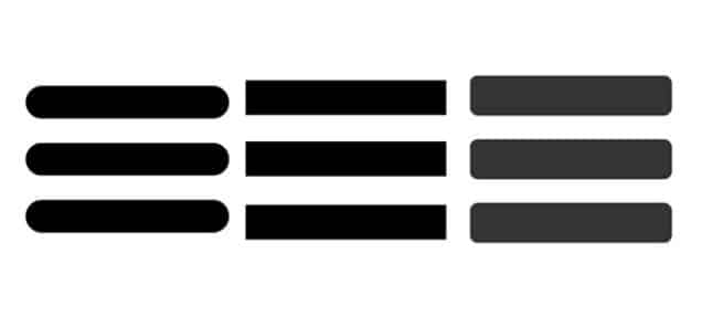
Ever paid attention to that hamburger menu? You know, that little square in the corner of a website? The clickable thing with the three vertical lines (like a burger in between two halves of a bun)? That thing you click to open navigation options?
This thing on the right (minus the cheese):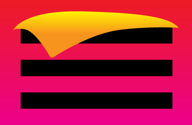
You may know this as ‘the hamburger menu’. If not, well… this is the hamburger menu. You’ve clicked on these UI tools a million times in the past couple years. They’re everywhere now, usually on the top left corner of a mobile optimized site.
The reason this tool has become so prevelant is simple: they free up site space. They allow site designers to focus on crisp, active imagery. The theory is that most people prefer to read as little as possible (particularly when they first visit a new site). They browse faster than ever and you’re more likely to hold attention with imagery that entices them to then take a deeper dive, ‘bite into the burger’, basically.
This tool helps pave the way for sites to utilize modern, image-driven UX standards.
Of course, this doesn’t prevent folks from hating them. The gist of the debate is that they hide too much content. Would you prefer to have those embedded options more freely available, even if the clutter up the site’s front page? Haven’t any number of sites proved that options can still be integrated into the main page while remaining aesthetically pleasing?
What say you:
Do you have a horse in this race?
How do you like your burger?